RachelSavageA2media2012+13
Thursday, 28 March 2013
Monday, 25 March 2013
The Last Stages Of Completion
Our teacher looked through each of our blogs and gave us our current grade and how we can improve them, above is a list of things I have to do. I have to do them before wednesday because that's our deadline.
To do list:
. Go through my blog making sure every blog post is high quality
. Finish my evaluation
. possibly create more posters/magazine reviews
I can see me needing to do a few all nighters, wish me luck.
To do list:
. Go through my blog making sure every blog post is high quality
. Finish my evaluation
. possibly create more posters/magazine reviews
I can see me needing to do a few all nighters, wish me luck.
Wednesday, 20 March 2013
The Making Of My Magazine Review
I went for the old approach to making my magazine review and decided to put all the detail on my review through paint (meaning the text), Is might be the less technical way of doing it but I find paint it better than what people think.
I then copied and pasted each part on a more up to date software called paint.net, resized them and it was pretty simple.
I then copied and pasted each part on a more up to date software called paint.net, resized them and it was pretty simple.
Tuesday, 12 March 2013
Monday, 11 March 2013
DVD
I spent the majority of this afternoon planning my questions for my evaluation and finishing off my final piece, converting it and burning it on a DVD.
I did this by exporting through quicktime, opening it up in handbrake and converting it to mp4. I then burnt it on a blank DVD that i'd previously purchased.
I did this by exporting through quicktime, opening it up in handbrake and converting it to mp4. I then burnt it on a blank DVD that i'd previously purchased.
Thursday, 7 March 2013
Magazine Review
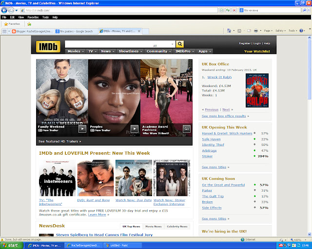
From looking at reviews online from IMDb and empire, and many more It made me realise I want my magazine to be online. I'd heard about a site called 'weebly' where you can create your own website, I figured because my review is going to be online why don't I just make the website. I decided I wanted my review to look like it was made for IMDb, however and this is a big however it proved more difficult than I'd thought. I can't get things exactly right through the limitations of the programme, and it's frustrating. Above is an example of what I've done, I'm now starting to feel that in the time frame and the difficulty I'm having getting it exact. I will possibly resort to just creating it on paint.net or photoshop.
My Attempts
The other day I decided It was time to put my short film on a DVD that I'd bought the previous day, however when I went on it I found that for some reason my first clip was unedited and so I had to do that again. I did this, but because I spent so much time playing 'find the technician' by the time I was ready to put it on a DVD a had to go.
I attempted to put it on the DVD again today (7/3/13) but wanted to make sure I had everything right, I made sure the text was right, added more names to my ending credits etc and was ready to export it. However by the time I was ready to do this college had ended, I stayed behind but it said it was going to take 2 hours. Normally when they say 2 hours they don't really mean 2 hours, so I wanted for as long as I could until I had to leave but it still wasn't complete and as a result had to cancel it.
WHAT WE HAVE LEARNT:
. I have to make sure I have enough time to export
. I need to know where the technician is at all times to keep walking at a minimum
. Exporting isn't fun
SO, tomorrow I will make sure to get this done.
Sunday, 24 February 2013
Finished The Short Film
Wednesday, 6 February 2013
Annotating Magazines
Above is a picture of the white board on college, on there is a guide from our teacher with how to create the
perfect magazine review.
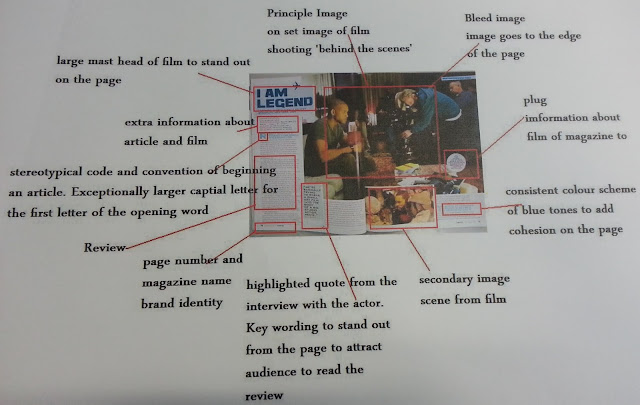
We then looked at a previously evaluated magazine review from a previous student for the film 'I am legend'
When then got a chance to review our own magazine reviews, but making notes on the outside as to what we think is important.
Sunday, 3 February 2013
Watching My Project - From Home
I decided to show my brother my media project I've been working on, I asked him what he thought..
"It was really good, I might be biased because I was in it but that was some pretty damn good acting if I do say so myself."
When asked if the narrative was clear he said..
"I think it is pretty clear, media is always open for interpretation. People take what they want from this kind of film, everyone isn't going to think the same but yeah I got it."
My nan then watched my short film, I asked her thoughts to which she said..
"Wow, yes I was really impressed how you made the split screen. How did you do that by the way? Haha. No but it really was impressive."
When asking about if she got the narrative she said..
"Yeah, I got him working in London and the two sides of it. I did understand it."
My Mum then watched my short film, when asked her thoughts she said..
"I really enjoyed watching it, having the spilt screen made it that much more entertaining with more to look at on screen."
I asked if she could also follow the narrative..
"I was a bit confused, I can understand where you were coming from with the plot and found it to be very interesting. I think I near enough got what you were meant to portray."
Our family cat decided he wanted to be involved, when asked what he thought he had nothing to say. He was nothing but unresponsive.
".........." - said the unhelpful cat
Working From Home
The school allowed me to take the mac home for the weekend as I didn't have one of my own to work of my project, I had a busy weekend but I made sure to make time for editing as it was important to me.
Showing My Teacher My Project
Rachel
-Strong opening shot
-Like the changes in colour - keep it consistent though
-Split screen audio volume change
-Out of bed-fade audio in a little more gently
Narrative ~
-Response - Left screen slower/relaxed
- Right more pacey/stressed/pressure
?Some make one screen?? My eyes
Getting off train? Need a rest
As right screen goes home audio jerks a little
However 2nd half exellent
Thursday, 31 January 2013
Poster Editing - Photoshop
Here I just wanted to see what both the original and edit would look like next to eatch other, honestly I think it looks too simple. It looks like something you could make on paint when you were 10. I need to make it more impressive and eye catching, possibly blend them together somehow? But also that placement looks too simple.
I attempted to place the same picture differently, but also include a previous edit. I favour this one a lot more due to it looking visually more intriguing. I also really like the edit at the bottom blending in with the bottom, this is where I would plan to have the title 'Is It Really Worth It?' I feel like I might keep this part. I wanted to portray the day.
Tuesday, 29 January 2013
Copyright
What is copyright?
When a person creates an original work, that he or she automatically owns copyright to the work. Copyright ownership gives the owner the exclusive right to use the work in certain, specific ways. Many types of works are eligible for copyright protection, including:
- Audiovisual works, such as TV shows, movies, and online videos
- Sound recordings and musical compositions
- Written works, such as lectures, articles, books, and musical compositions
- Visual works, such as paintings, posters, and advertisements
- Video games and computer software
- Dramatic works, such as plays and musicals
Ideas, facts, and processes are not subject to copyright. In order to be eligible for copyright protection, a work must be both creative and fixed in a tangible medium. Names and titles are not, by themselves, subject to copyright protection.
Is it possible to use a copyright-protected work without infringing?
In some circumstances, it is possible to use a copyright-protected work without infringing the owner’s copyright. For more about this, you may wish to learn about fair use. It is important to note that your video can still be affected by a claim of copyright infringement, even if you have...- Given credit to the copyright owner
- Refrained from monetising the infringing video
- Noticed similar videos that appear on YouTube
- Purchased the content on iTunes, a CD, or DVD
- Recorded the content yourself from TV, a movie theatre, or the radio
- Stated that “no copyright infringement is intended”
(Here is an article from youtube about copyright, I'm bringing the topic up because in my short film I plan to use parts of a song that I didn't create called '1000 Years Always By Your Side' by the Korean group SHINee. Because I'm chopping it up and reassembling it, it isn't exactly the original copy. And because I'm not planning to use it to make money and through being a student I can use this. Due to this song being foreign the likelyhood of me actually getting in contact with the company to ask permission to use their song is very slim.)
http://copyrightfriendly.wikispaces.com/
(Another link about copyright)
Monday, 28 January 2013
Copyright Permission
For my short film I decided to find a piano cover of SHINee's song '1000 years always by your side', and to do this I looked on youtube. I found a cover near enough straight away, it impressed me so much that I felt like I had to use it. Out of copyright reasons and respect for this youtube user I asked in the comment section If I could use their cover in my short film. Not much time later they replied back saying that I could, but to make sure I mentioned them somewhere which of course I was going to do regardless. But they made me happy.
The youtube users name being the very talented 'Richardhuang70'
The youtube users name being the very talented 'Richardhuang70'
Poster Ideas
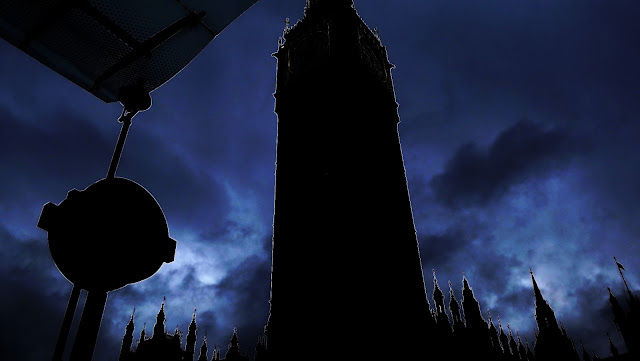
I took the above photo when I was in London filming just because we were there, I look back at it now and think to involve it in my film poster would be perfect. Big Ben and the underground sign are iconic things linked with London, just by looking at them you know where the short film is set. What I like most about it however is how much sky there is, and because day and night play a big part in my short film I was thinking if there was a way I could edit it to make it look like night time.
I decided to play around on paint.net that i've previously used for art, I attempted to change the sky to make it darker and achieved it by changing the 'levels'. However what has come with that is a big ben that is near enough blacked out, but even though this wasn't what I intended I like it like that. It gives it an eery feel and it's completely different from the daytime picture. But then I think it would be better if the picture was just slightly different from the original, giving the idea that doing one little thing different in a day can change it completely.
SHINee - 1000 Years Always by Your Side (Music Video)
For my project I'm using the Japanese single from the Korean band SHINee called '1000 Years Always by Your Side' I remembered that the music video has a lot of sky and outdoors scenes, thinking about the lost posters I wondered if I could take a scene from the MV (music video) for my poster. I watched the MV all the way through and print screened scenes that interested me, and what I felt I could use.
^^ Above are speakers with the background of just a plain blue sky, at the beginning all you hear is the siren going of with this scene for a few seconds before the music starts. I feel like this is similar to my short film with the alarm clock. With the colour I really like how plain it is, the way that just by using this background the speakers stand out so much. However because of the dull colours and shapes it doesn't pop out at you, which for a poster I guess is what you want it to do. Even if my short film isn't happy, it still needs something on the poster to catch the audiences attention.
^^I only took this screen shot of Minho's clothes because I really liked the olden style, I wouldn't really know how to incorporate this in to my final poster.
^^ Just further scenes that show a large open space with something else in front of it that grabs the watchers attention, in that they know what they have to be focusing on.
^^ This scene is completely different from the rest, the singers blend in with the back rather then stand out as they're both black. I like the idea of things standing out and blending in for my poster? I have of yet not decided how I'm going to do this.
^^ In this scene theres added colour with the balloons, what I like about it is how suttle it is.
^^ Each member is in unison, doing to same pose against a background with many different suttle colours. I think I like the scene for more of the fact of me being a fan of them (my fan girl side is here) but I think it's such a strong site, they're all together.
^^ I knew anyway for my short film that I wanted a black screen with white writing, it's just lucky for me that this music video also has this scene to give you an example of what I want. I've yet to decide if I want another language as I am using a japanese song, however because my short film is set in London..I don't really think it will be appropriate.
^^ Above are speakers with the background of just a plain blue sky, at the beginning all you hear is the siren going of with this scene for a few seconds before the music starts. I feel like this is similar to my short film with the alarm clock. With the colour I really like how plain it is, the way that just by using this background the speakers stand out so much. However because of the dull colours and shapes it doesn't pop out at you, which for a poster I guess is what you want it to do. Even if my short film isn't happy, it still needs something on the poster to catch the audiences attention.
^^I only took this screen shot of Minho's clothes because I really liked the olden style, I wouldn't really know how to incorporate this in to my final poster.
^^ This scene is completely different from the rest, the singers blend in with the back rather then stand out as they're both black. I like the idea of things standing out and blending in for my poster? I have of yet not decided how I'm going to do this.
^^ In this scene theres added colour with the balloons, what I like about it is how suttle it is.
Sunday, 27 January 2013
Poster - Lost
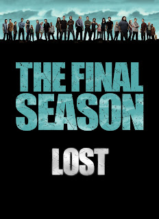
I know Lost isn't a film it's a television series, but the poster for it caught my eye with how simple it was.
What I like most about it is the simplicity, all you have is the shows title, the shadowed characters that we know nothing about yet (as this was a promo poster) and a very dull background. It says nothing about the show, and so will encourage you to learn what the show is about. This is the kind of design I want for my film poster.
The style of the posters never change, they are simplistic however the characters and background have gained colour. As the show became increasingly more popular the style became more recognisable. Just by looking at the title style you could tell what show it was from.
These posters show another season that is coming soon, and due to how simple they are they give nothing away about the season.
What I like most about it is the simplicity, all you have is the shows title, the shadowed characters that we know nothing about yet (as this was a promo poster) and a very dull background. It says nothing about the show, and so will encourage you to learn what the show is about. This is the kind of design I want for my film poster.

The style of the posters never change, they are simplistic however the characters and background have gained colour. As the show became increasingly more popular the style became more recognisable. Just by looking at the title style you could tell what show it was from.
These posters show another season that is coming soon, and due to how simple they are they give nothing away about the season.
You see even when making the merchandise they keep the same style, it's well known, it's the 'brand'
Tuesday, 15 January 2013
Bus Breaking Down
It disappoints me, but I didn't make it into college today to edit my short film due to weather conditions. I got on my first bus of two (due to living in the middle of nowehere), but due to it snowing heavily we got stuck behind an accident ahead for an hour. The bus then traveled further but broke down near enough in the middle of nowhere. I spent the rest of the day in a near by hospitals canteen waiting for someone to come and pick me up.
Monday, 14 January 2013
Music - Piano Covers
Currently
I've been working on my blog all morning and this afternoon (due to one of my lessons being cancelled) our technician has been helping me learn and get to know final cut express, even though it feels complex right now I feel if I use it enough it'll be fine. Our deadline for this short film is Thursday, I wont lie and say I'm confident because with all the switching around and trying to get to know new software late I don't feel prepared. I have a day off tomorrow (15/1/13) and so I plan to come in tomorrow and work on getting my project finished, If I don't I will come in whenever I have free time.
Fingers crossed it works out and on time. *crosses fingers and makes everyone around her cross their fingers*
Fingers crossed it works out and on time. *crosses fingers and makes everyone around her cross their fingers*
Final Cut Express HD
After many troubles with final cut it's finally decided to work on the macs at college, our technician has said he's played around with the software and he's convinced that it will now allow me to split screen ('spilt screen' now becoming the most used words in my life) however the only downside of using final cut is that I can only use it at school as I don't have a mac at home. This gives me a very limited time of when I can work on my project due to lessons and other commitments, But this is very important to me, I will do my best to get it done.
Subscribe to:
Comments (Atom)


